Designing with concepts
How to make software that's more enjoyable, learnable and effective for users
In his book The Essence of Software: Why Concepts Matter for Great Design, author Daniel Jackson says that all apps are made up of collections of “concepts” each a “self-contained unit of functionality.”
A concept isn’t exactly a design pattern, feature or job to be done. So, what is it?
“You’re already familiar with many concepts, and know how to interact with them. You know how to place a phone call or make a restaurant reservation, how to upvote a comment in a social media forum and how to organize files in a folder.”
So when you write an email in Gmail, or message a friend on WhatsApp, you’re not just scrolling screens and tapping buttons, you’re relying on these invisible “concepts” like Inbox and Conversations.
Concepts are everywhere, characterizing every app.
Another common concept is a comment. You might find comments on a NYT Cooking recipe, a line in a Google Doc or a video on Meta. A comment lets users to respond to something specific. Like a comment, but a bit more specific, an upvote on Reddit lets users to show they support a post, making it more visible to other members.
If you’re responsible for designing software, you’re likely already dealing with lots of concepts that were “invented by someone at some time, for some purpose… (and have) undergone extensive development and refinement over time.”
Well designed concepts means better usability
‘So what?’ you’re thinking. I’m a designer, I’m focused on real problems like usability, not abstract concepts.
Well, what makes software difficult to use? Sometimes it’s because features are missing or hard to find but usually (it only takes one user testing session to learn this), it’s because “the user has a mental model that is incorrect—that is, incompatible with the mental model of the designer and implementer of the software.”
Or in other words, the user experiences bad design.
We can design better software when we understand how our users think about the software – their mental models. And likewise, “An app whose concepts are familiar and well designed is likely to be easy to use, so long as its concepts are represented faithfully in the user interface and programmed correctly. In contrast, an app whose concepts are complex or clunky is unlikely to work well, no matter how fancy the presentation or clever the algorithms.
‘Style’ - A closer look at a word processing concept
I first learned about concepts from Daniel Jackson years ago. The thinking resonated with me, but as a product designer I struggled to put it to use. Since concepts ‘have no visible form, they’re rather abstract’, it’s easy to overlook and dismiss them.
One simple way to work with concepts is to compare how they’ve been expressed in similar apps. Take word processing for example. It turns out Microsoft Word & Apple Notes share lots of the same concepts like paragraph, format and style.
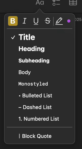
In Notes, an app created by Apple to help “jot down quick thoughts”, clicking a button in the toolbar opens a menu with 9 preset styles.
In Word, there’s also a similar Style menu in the Toolbar, but instead of 9, there’s 16 preset styles. When you resize the window, more styles become accessible in a visual ‘Style Gallery’. Fancy. There’s also a side panel so you can see all the styles while you type as well as heavy duty style management in settings.
Style is a foundational concept, which is why it appears in both apps and works in pretty similar ways. But small differences point to different product decisions, target users, and even company values.
Designing with concepts
Aside from discovering concepts in apps you use, here are a few ways to bring concepts into the actual design process.
The less the better: Aim to use the smallest set of concepts users need to get the job done. Simple doesn’t necessarily mean less functionality or more white space. It’s true that some of the best designed apps are simple, but they are simple because they use a small number of elegant concepts – or paraphrasing Gall’s law, “evolved from a simple system that worked.”
Don’t overload: If you’re thinking of introducing a new concept into your product, always make sure it has a clear “purpose”. Don’t overload a concept to make it try and solve lots of different problems at once. In Word, buttons for formatting text appear near to the Style panel (because that’s where one might expect them to be) but they aren’t all mixed up in same menu.
Where are concepts failing? When you test a design with a user, consider if they are having trouble with a particular interface element or bit of content, or if there might be a broader issue with how concepts have been designed and implemented.
UI widgets don’t determine the success of a successful product, well designed concepts do. When we work with them directly, we can design systems that are more enjoyable, learnable and effective for the user.
Want to learn more? Daniel Jackson has created a lot of content on this subject:
Short read: Software = Concepts (6 min read)
Watch: What makes software innovations succeed? Maybe not what you think. (13:30)
Long read: The Essence of Software: Why Concepts Matter for Great Design (336 pages)
Originally published on Buddha.Bike


